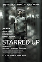
A poster should be eye grabbing and primarily illustration, any text on it should be short and sweet. This textual information may be a quote from the film, the title, BBFC rating, release date and the cast. It should make the viewer want to go an watch the film and uses the ratio of 50:50 text to picture to provide them with enough knowledge of whether or not the film is for them.

As you can see by the two British film drama posters to the left, they do not always use shots from the film and instead use the concept art they have drawn up from the narrative as to make use of their artist and not give anything away before the trailer comes out. An icon is very important to have on a poster because they need them to help understand the genre and this will effect whether they like it or ignore it.
The Suffragette poster shows the main character/icon in the centre foreground behind text which makes her look like a criminal getting a mugshot for breaking the law, giving away hints to the viewer about the narrative.
Starred Up's poster presents the main character stood in the centre of a prison block with no one else around suggesting that despite the number of cells with inmates in them he is in fact alone. This makes the viewer subconsciously question why.
If the film is a large recognisable brand with lots of sequels, the poster does not always need a title of the film which leaves more room for illustration and the release date, which is what people will focus on.

No comments:
Post a Comment